The lighting in my office, isn’t the best for getting photos of my work, but here is a menu that I created a few weeks ago for a food truck located at one of our government agencies.
Logo by the talented Isabella Castro
The lighting in my office, isn’t the best for getting photos of my work, but here is a menu that I created a few weeks ago for a food truck located at one of our government agencies.
Logo by the talented Isabella Castro
Tradeshows usually involve lots of handouts and I wanted to created something different that would stand out amongst a sea of other handouts and goodies.
I created this square design to showcase our different lodge properties and all of their amenities.
Don’t let anyone fool you, but I love designing infographics. This is a page out of our annual company newsletter that was distributed to all of our employees.
For the past year I have been training in the circus arts, which includes pole dancing. So after a year of training, I finally “graduated” from the basic moves to a “Pole Master,“ meaning that I will be learning more advanced and complicated moves and transitions.
Here is the graduation program that I put together… obviously, my song choice was Brit Brit! *duh*
Late last year, I was asked to create social posts for some of our properties encouraging followers to get outside and hike/paddle at advertised locations. Below are a few of the graphics that I thought really stood out.
View on Instagram
View on Instagram
The graphics below were drafts that didn’t make the cut because we wanted to promote individuals to get outside and explore, but I still really like them.
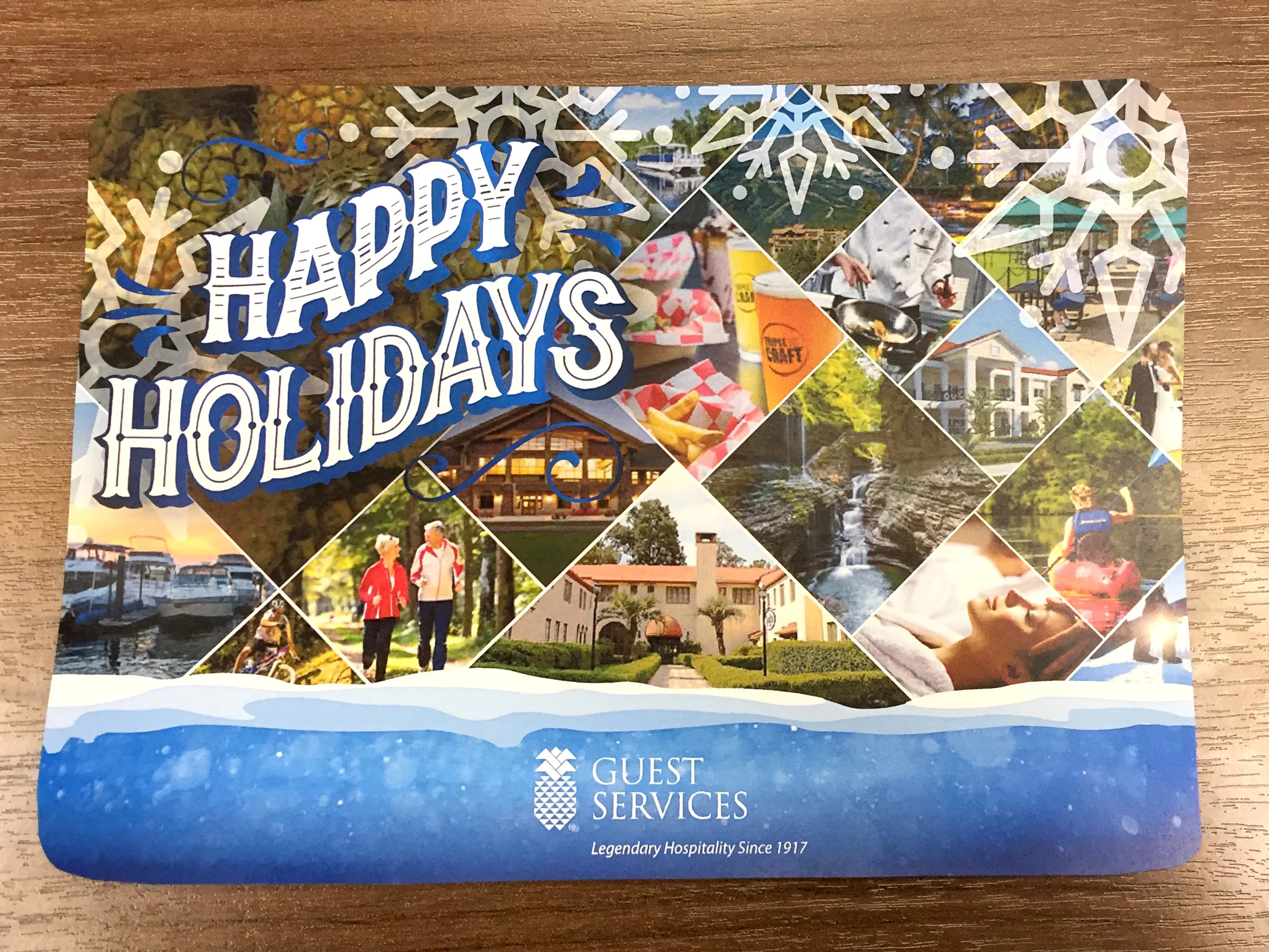
We wanted to do something simpler than last year, and I’m digging this year’s design. It’s hard to tell in this photo but both “Happy Holidays“ and our company’s logo are embossed.
I love using different fonts to create phrases that look like logos and I think “Try our New Winter Menu“ came out really cool (pun intended).
These signs were made for Hogan Lovells in DC. The client asked for the “Before“ signs to be replaced with something more sleek that fit with its modern dining space. The photo frames used for the “After“ signs helped achieve a cleaner design and I had a blast doing the product photoshoot and playing tetris with the required products so all items were showcased.
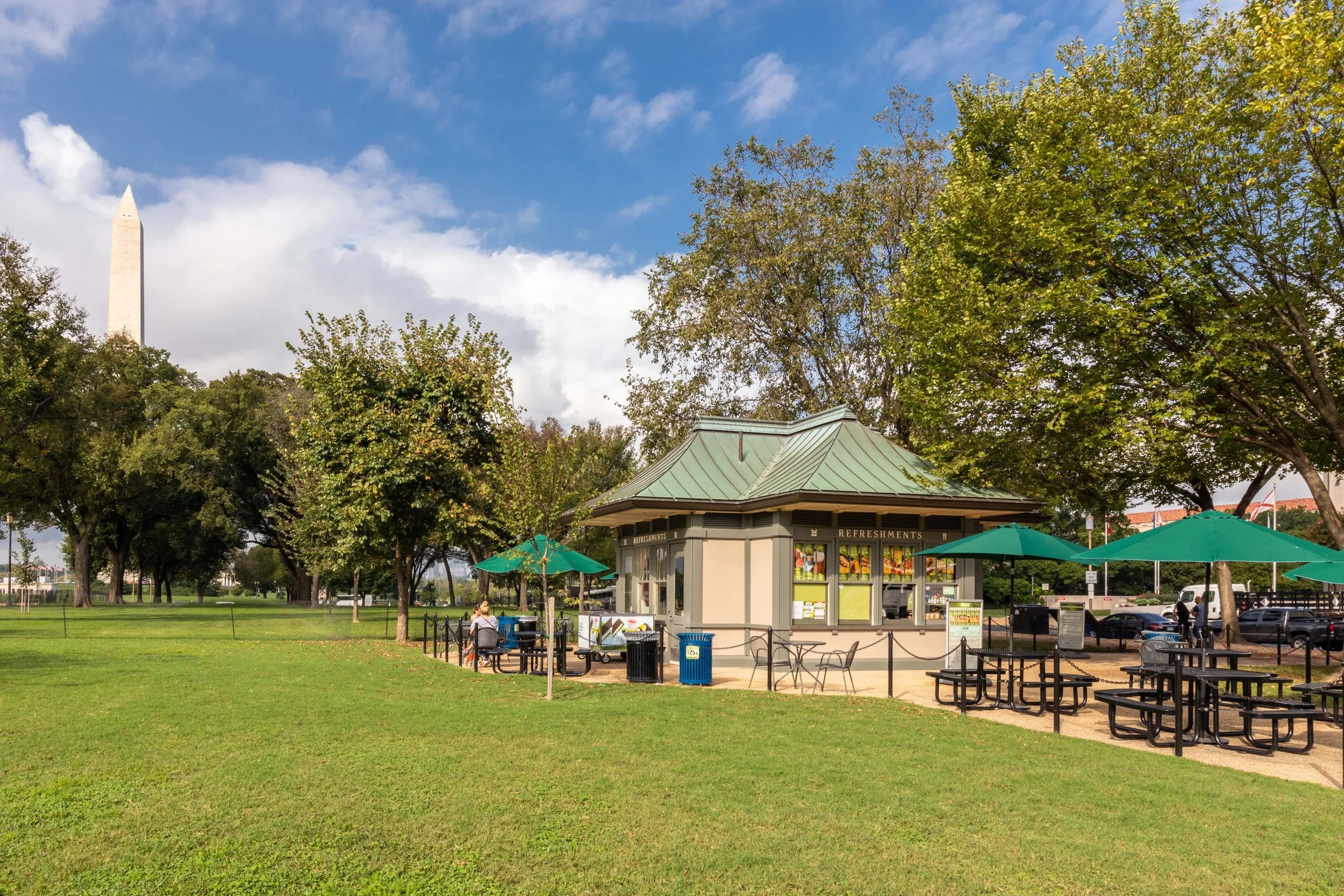
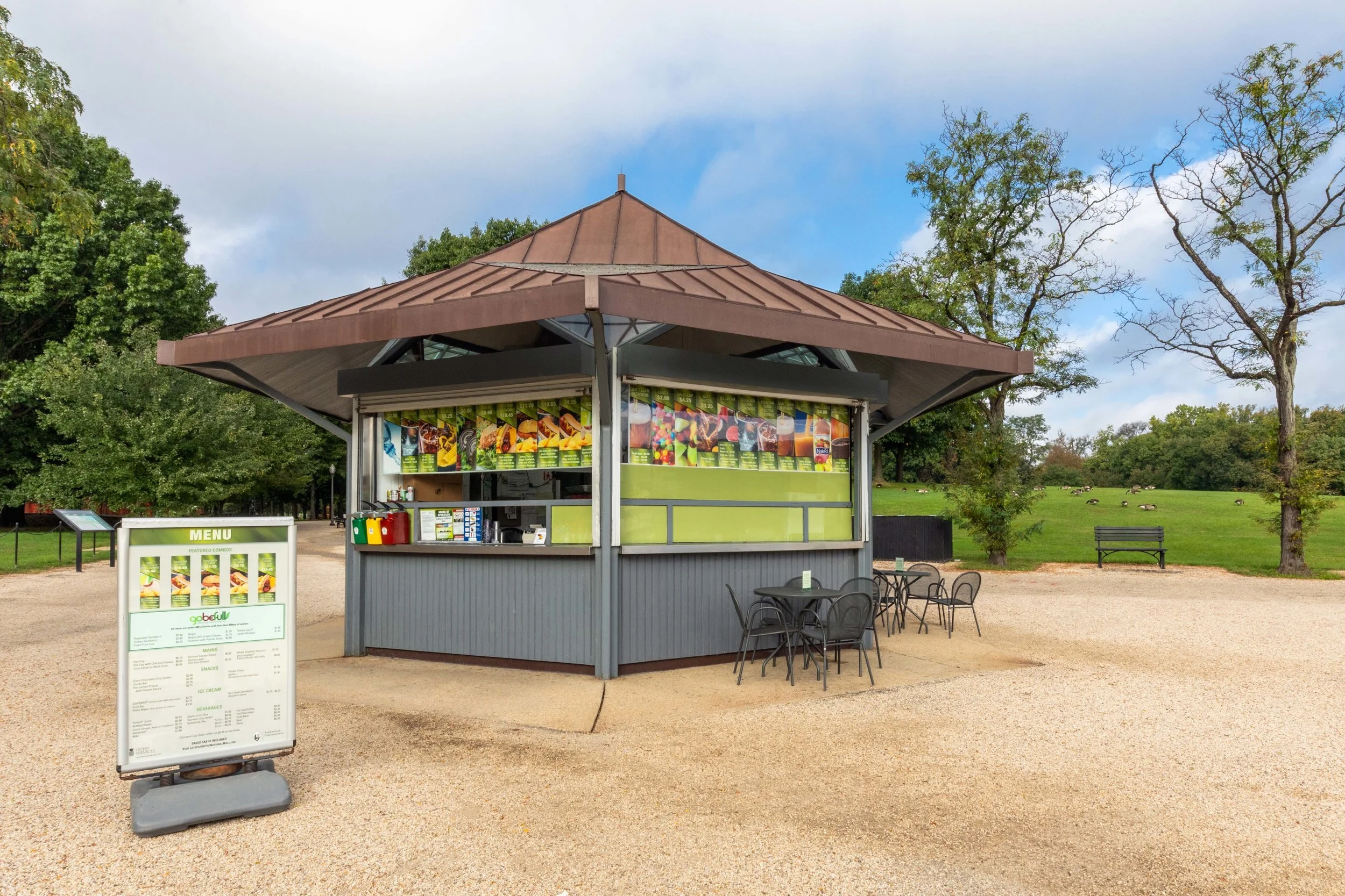
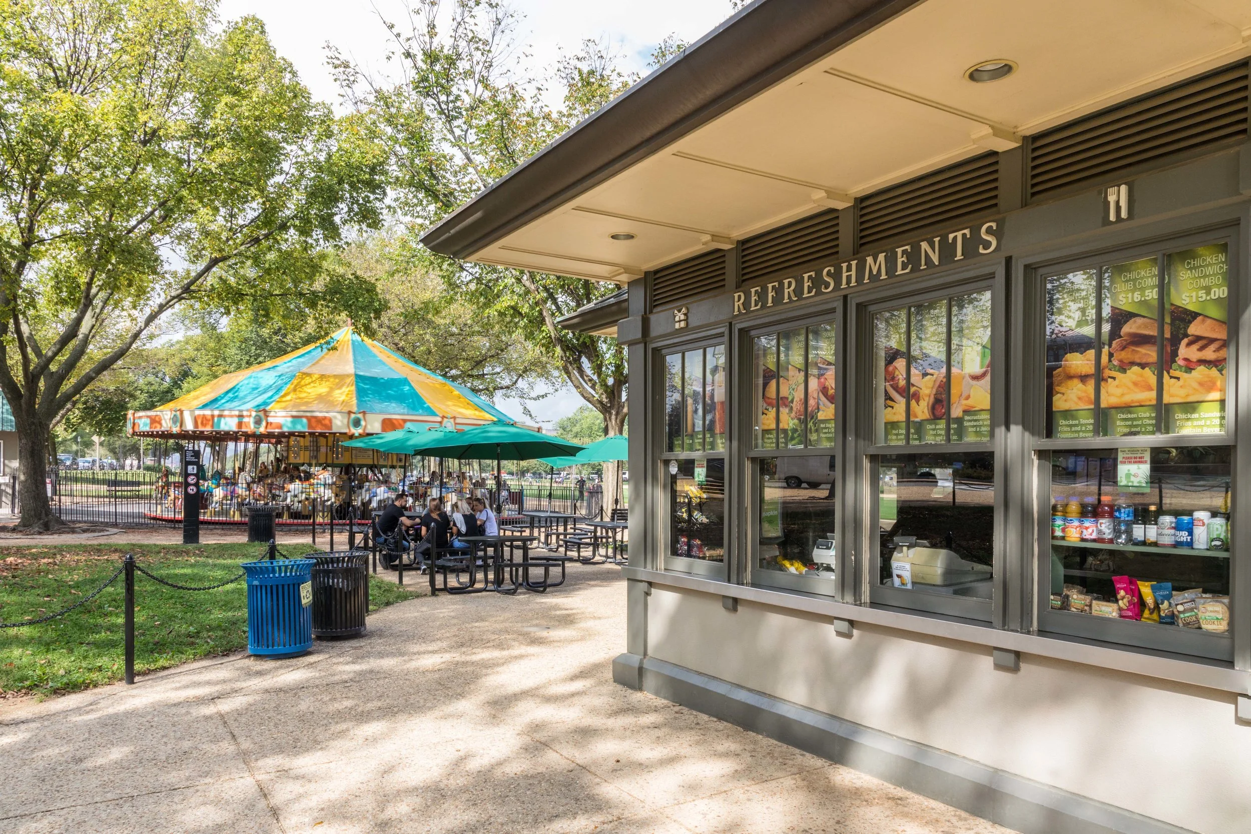
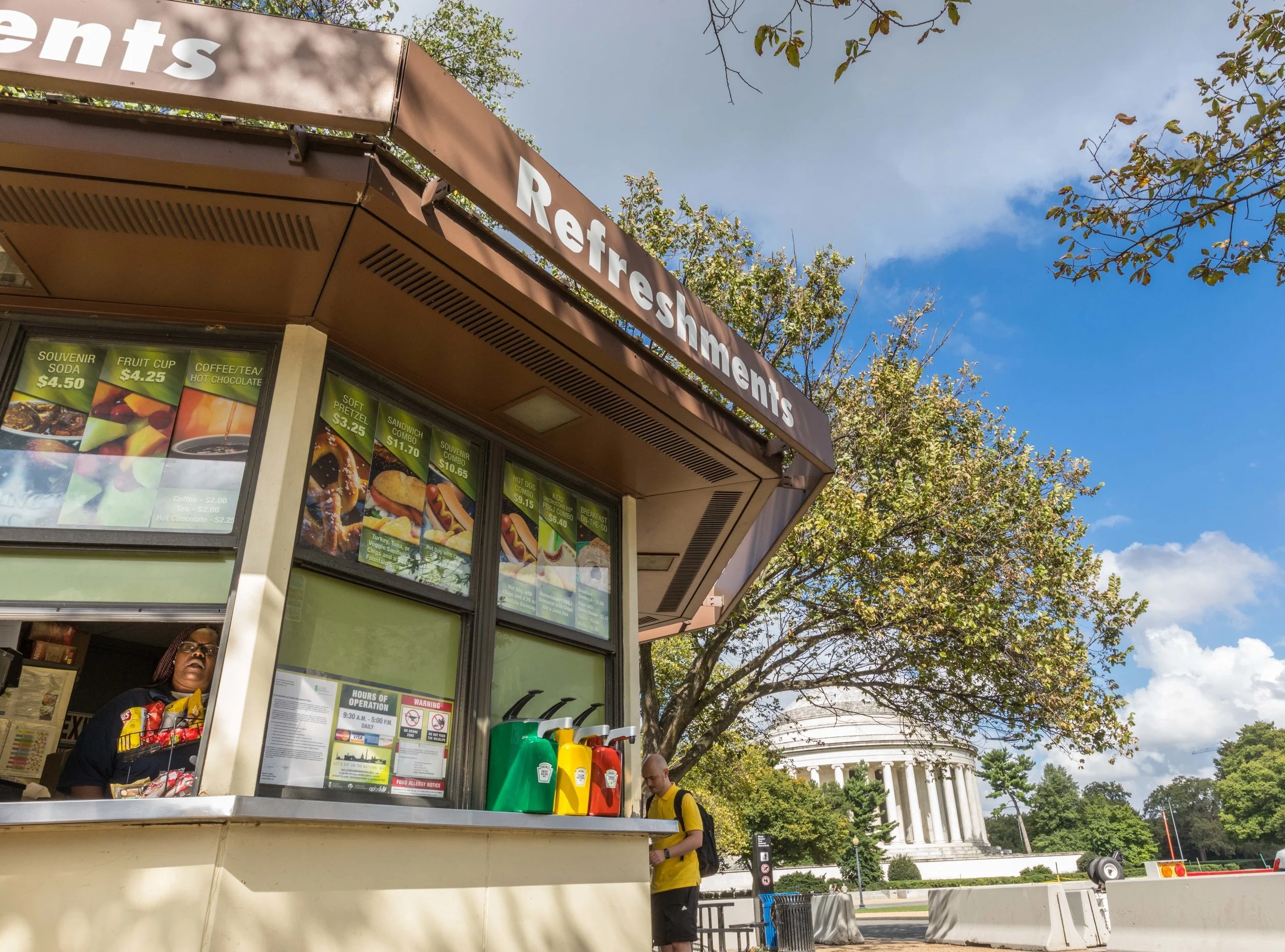
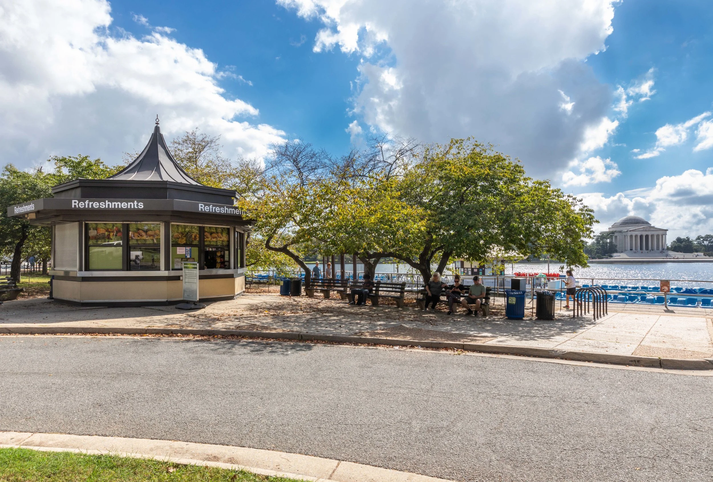
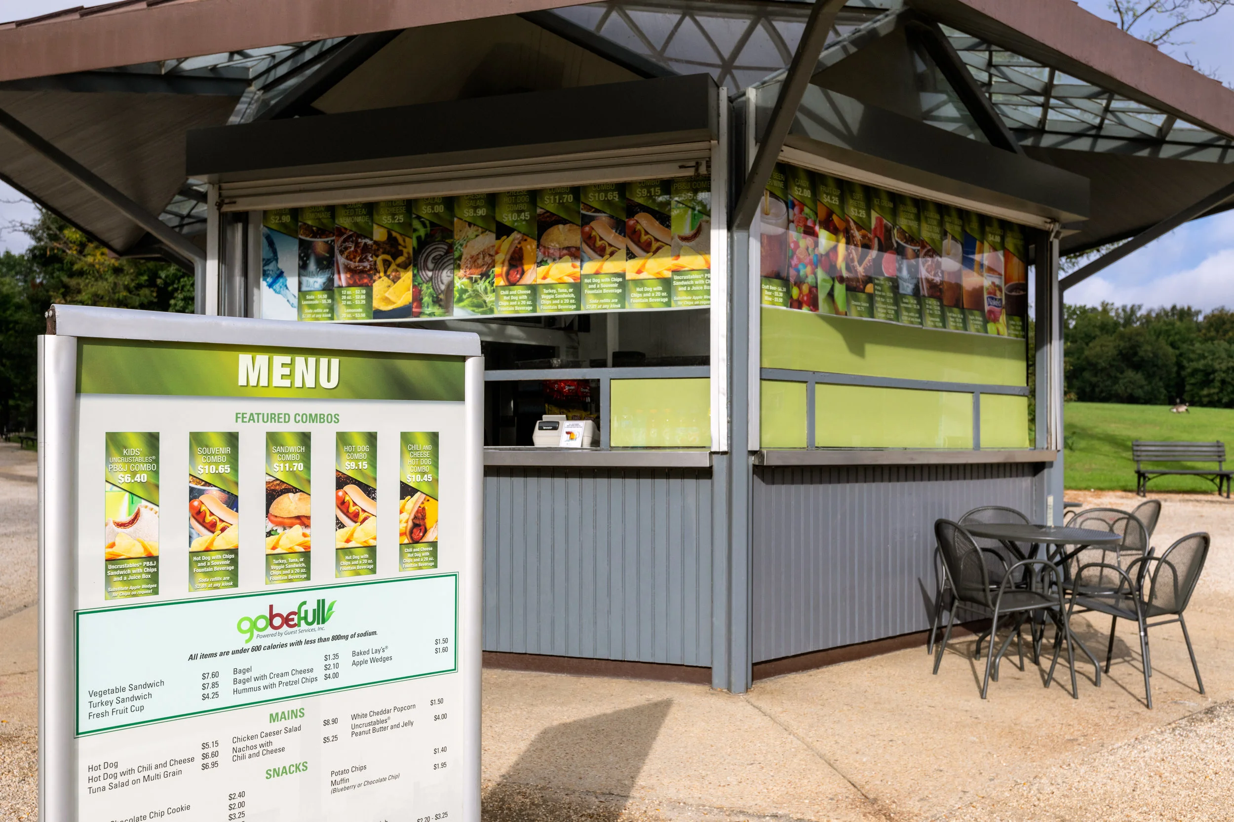
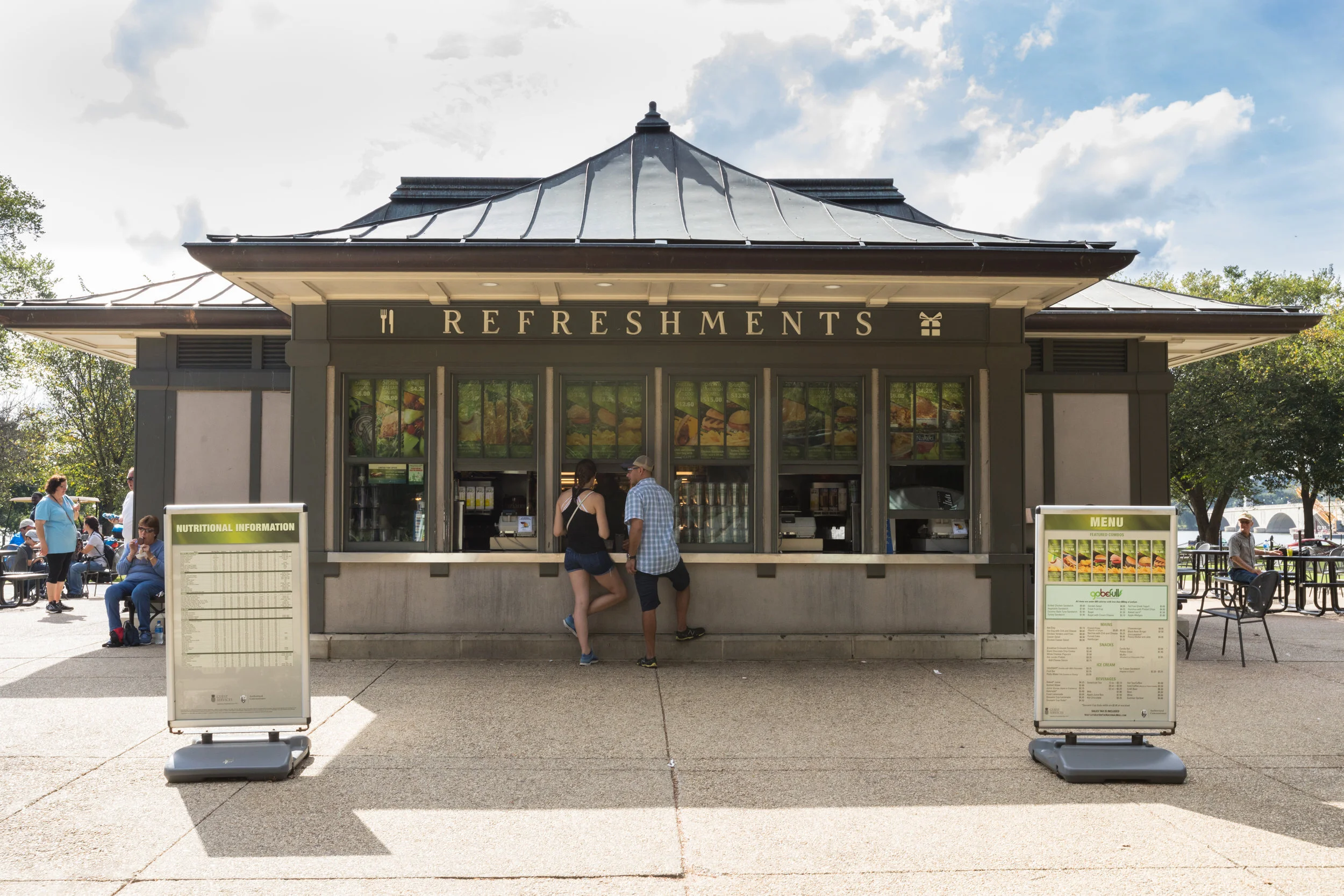
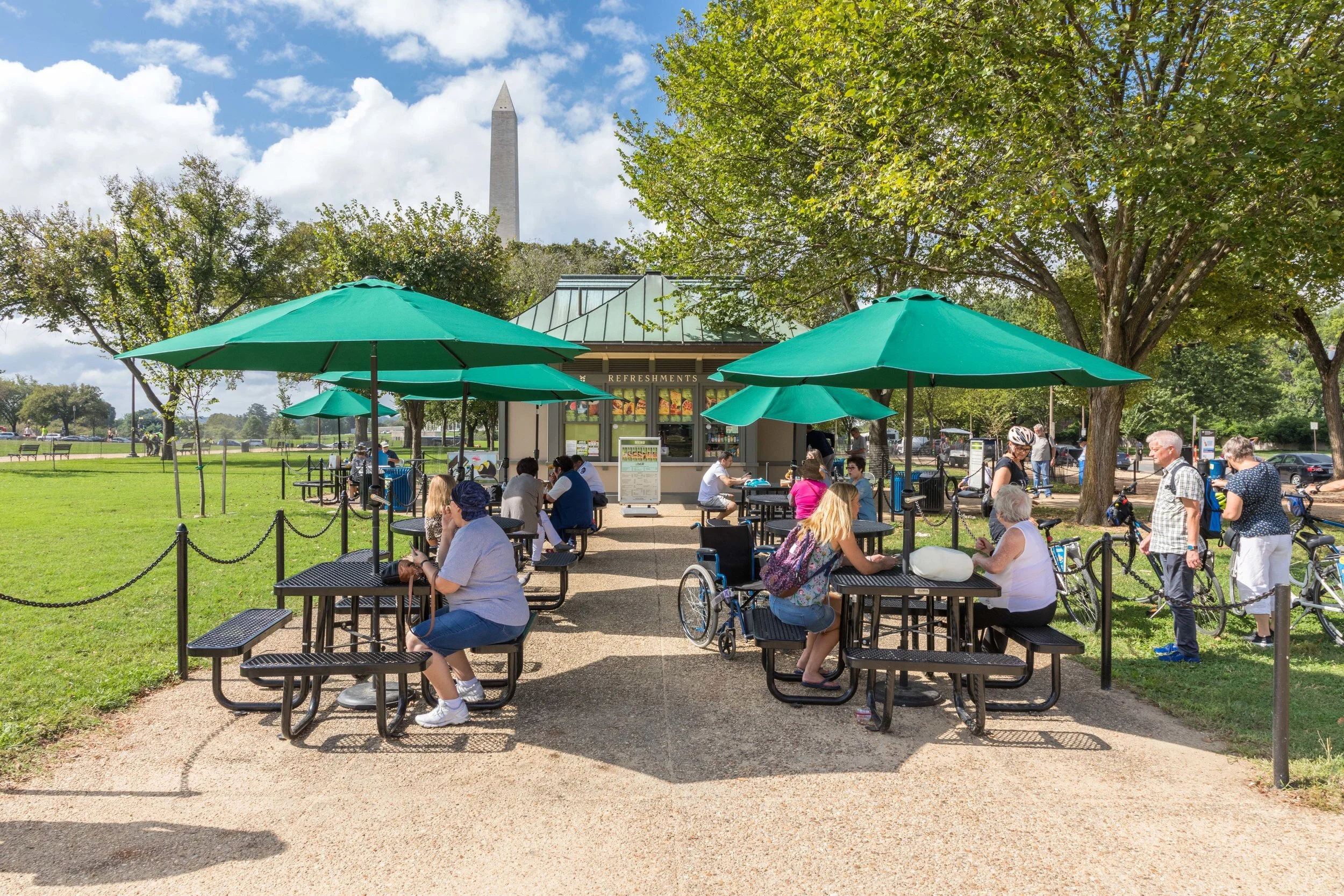
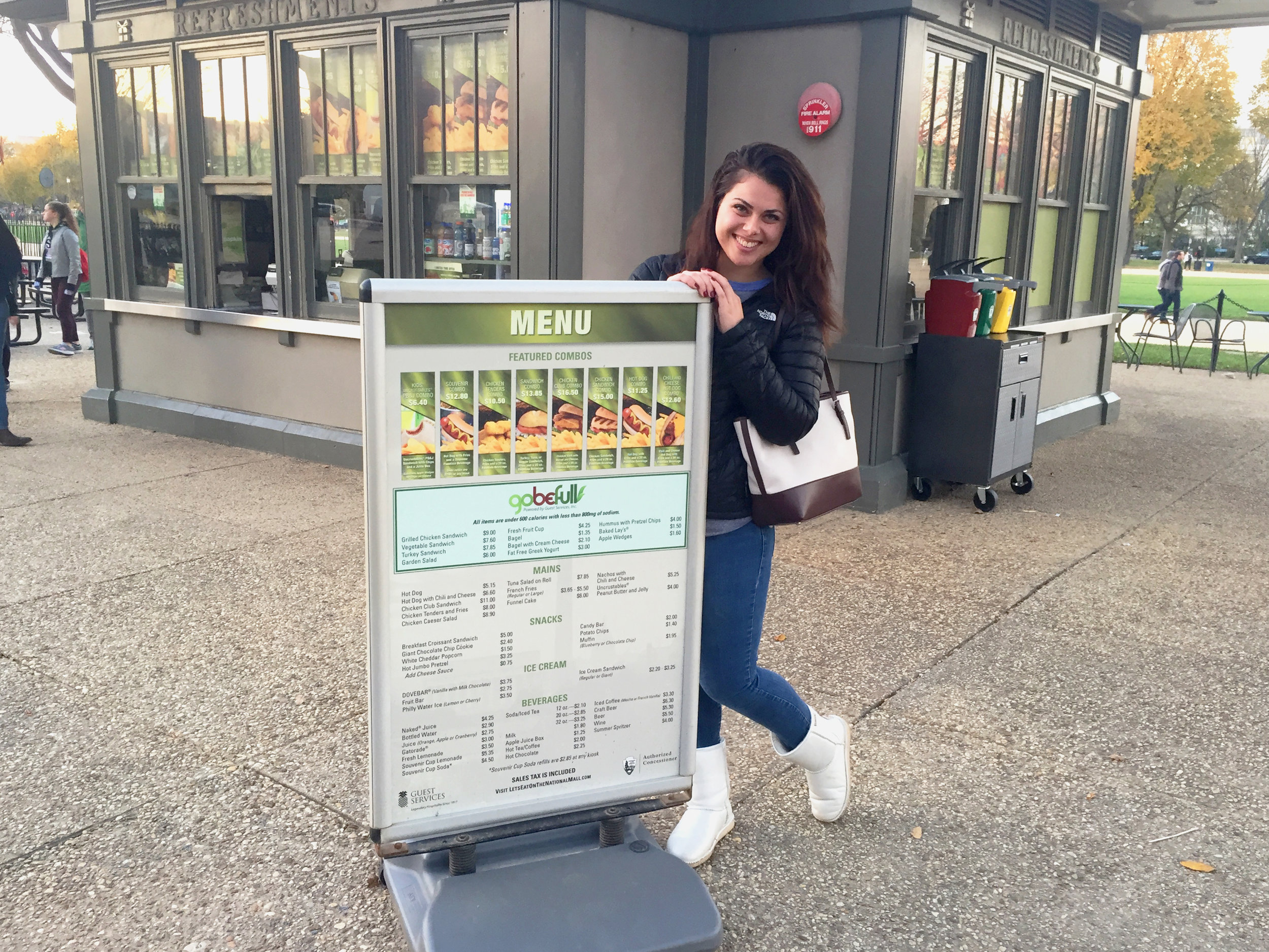
Today was the first time that I visited the National Mall in DC to see my menus, product panels, and the window perf. It’s funny how I live so close to DC and never visit.
A couple of months ago I created a save the date card and invitation for our company’s 25 Year Dinner event. The theme was “Evening with the Stars.“
More than 25 million people visit the National Mall in Washington D.C. each year, and according to the National Park Service, that’s more visitors than Yellowstone, Yosemite, and the Grand Canyon National Parks combined!
My company is the National Park Service Authorized Concessioner for the National Mall and Memorial Parks, and last year I was given the incredible opportunity to produce signage and menus for the National Mall’s kiosks and vendor carts, allowing the company significant visibility and exposure to millions of tourists and Mall visitors.
Given the size and scope of the project, exceptionally high quality products from our Marketing team were required to showcase the menu items at our ice cream carts and eliminate any possible confusion between the carts and general information booths. Additionally, at the kiosks, we wanted to create a cleaner, more professional appearance and took strides to declutter the window messaging.
We also took the initiative to install perforated film on the windows to obscure the view of any cords and disarray inside the kiosks.
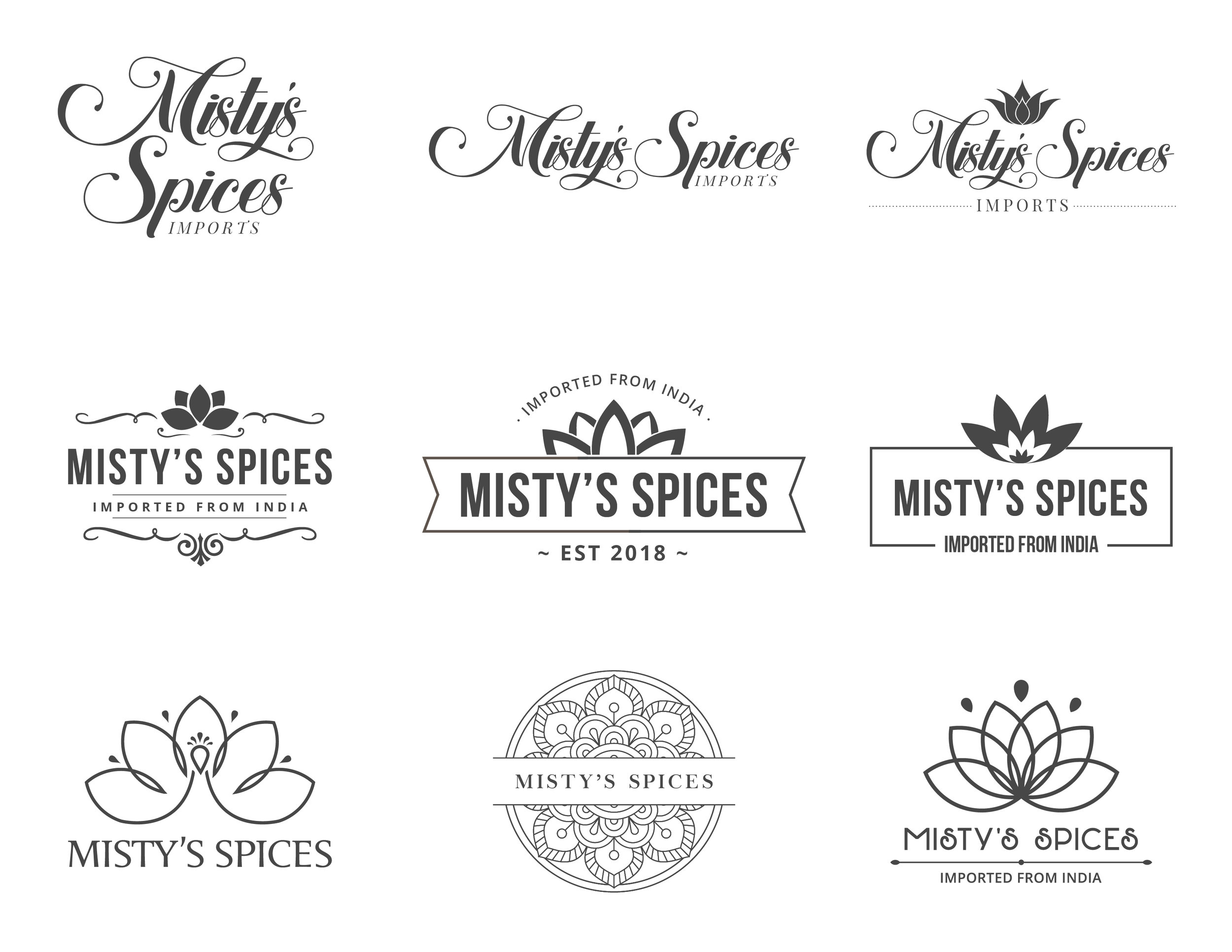
I worked on a logo design for an Indian Imports company called Misty’s Imports. Originally, the company was called Misty’s Spices Imports. Here is the final logo and a few other logo variations that I presented.
Final Logo:
Logos Presented:
Sometimes I make signage that makes me laugh because you have to question, who was the genius that ruined this for everyone else?! I firmly believe it’s impossible for a “common sense” sign to exist without a good story to back it up.
These signs were made for the Pavillon Café at the Sculpture Garden in DC. with the intent to rotate out the wildlife signage with new and seasonal promotions.
Just picked up some flyers I designed from a local printer for an upcoming Health and Wellness event that our company’s nutritionist will distribute.
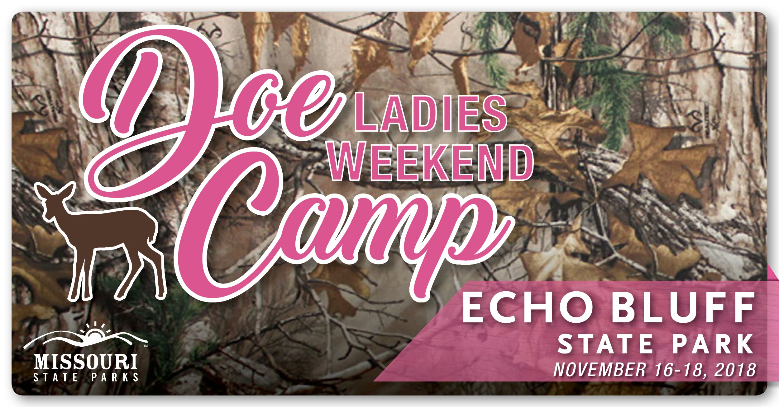
I created a social media ad for a ladies weekend away while the guys go off hunting. I created the Doe Camp logo in 2017 and updated the design of the ad this year.
Haven’t posted any freelance/Etsy work I’ve done recently. I created this card in either 2015 or ‘16 and was asked to revamp it after someone saw it on Pinterest.
A few months ago I was asked to create a water bottle design for our Rainier properties to sell at their retail locations. In addition to the water bottles, I created this flyer to advertise the NPS and Rainier properties’ initiative. I read an article recently that instagram/social media posts perform better when a 3D element is added to it, so I’ve started incorporating that into more of my designs.
Today, was the first time I saw one of my kiosks menus in the wild at Great Falls, VA. I noticed they were using an older version, than what they should be using, but it was still really cool to see my work off the screen.
I rarely get to see my projects in their finished state, so it’s always fun to spot someone wearing one of your designs… even if it’s only on Instagram.
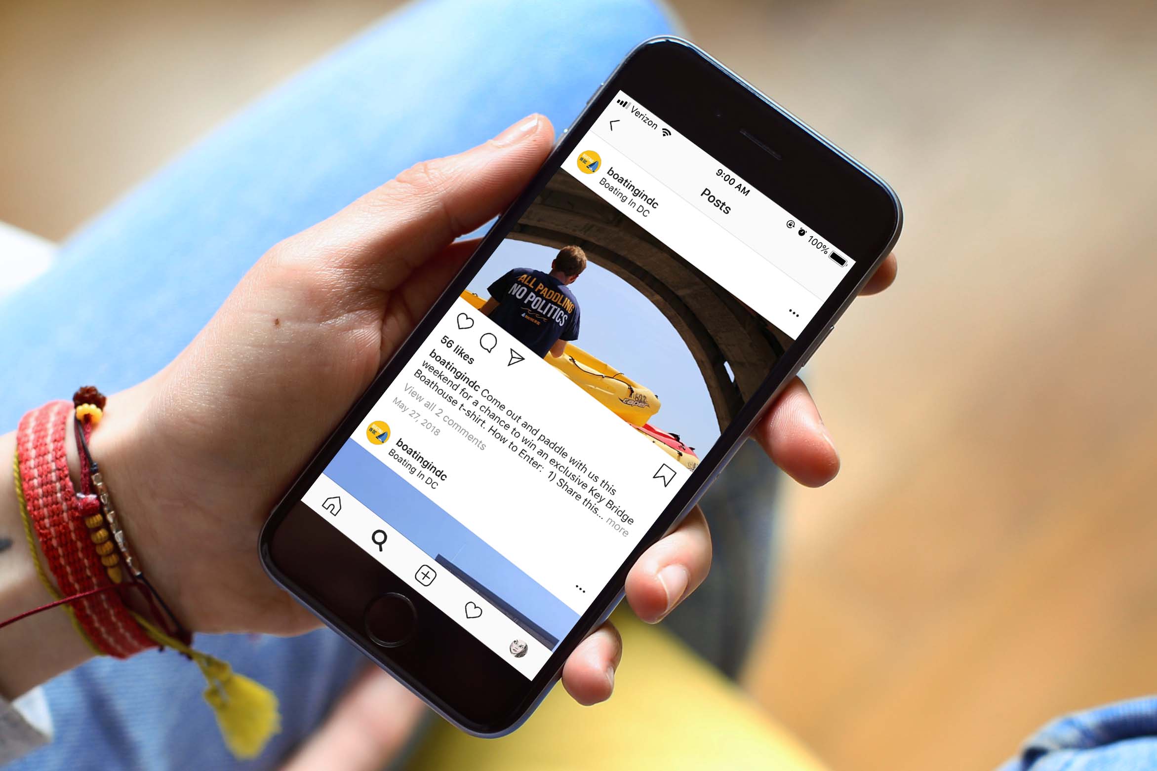
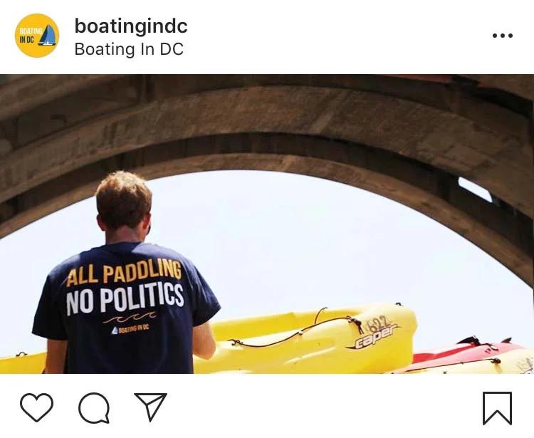
Quick peak of a social media ad that I just made.