What Could Go Wrong? Embracing a Situational Approach To Leadership
in Digital
This is a new infographic I developed for my company’s blog.
5 Goals to Set for Goal-Based Retirement Planning
in Digital
This is a new infographic I developed for my company’s blog.
5 Best Practices for a Connected Virtual Workforce
in Digital
This is the start of a new series of infographics that I developed with our copy team. Our plan is to take the lessons being taught in our Webinar Series and start delivering that information in an infographic format.
Public Service Recognition Week Video
in Video
This was a quick 30 second spot that I developed for my company’s socials.
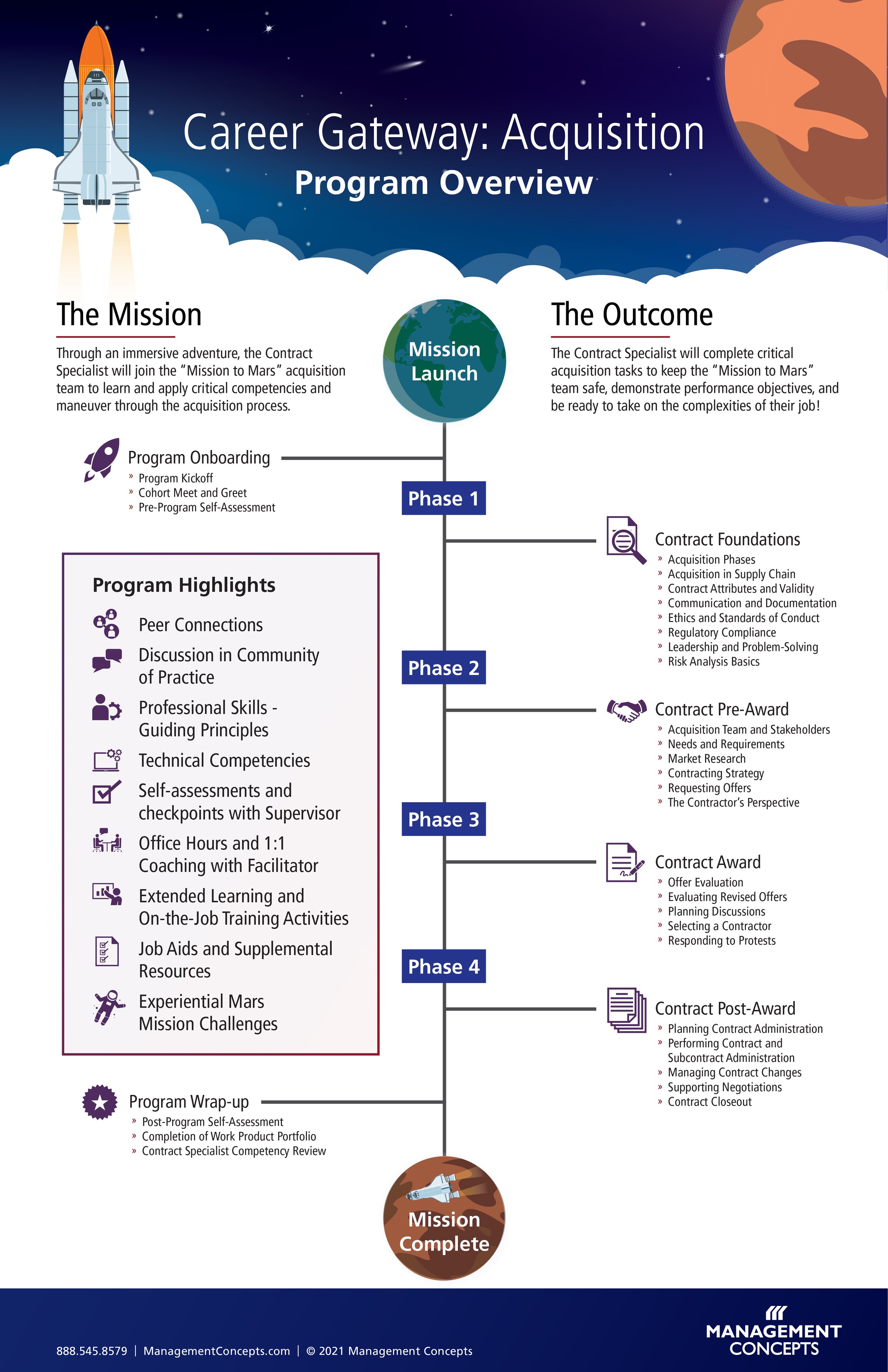
Career Gateway: Acquisition Infographic
in Digital
Most projects I work on use some sort of template for brand consistency and time efficiency, but about two weeks ago, I was able to fully develop a new design for an infographic that would be used as the template for an interactive/animated version using the Ceros design platform.
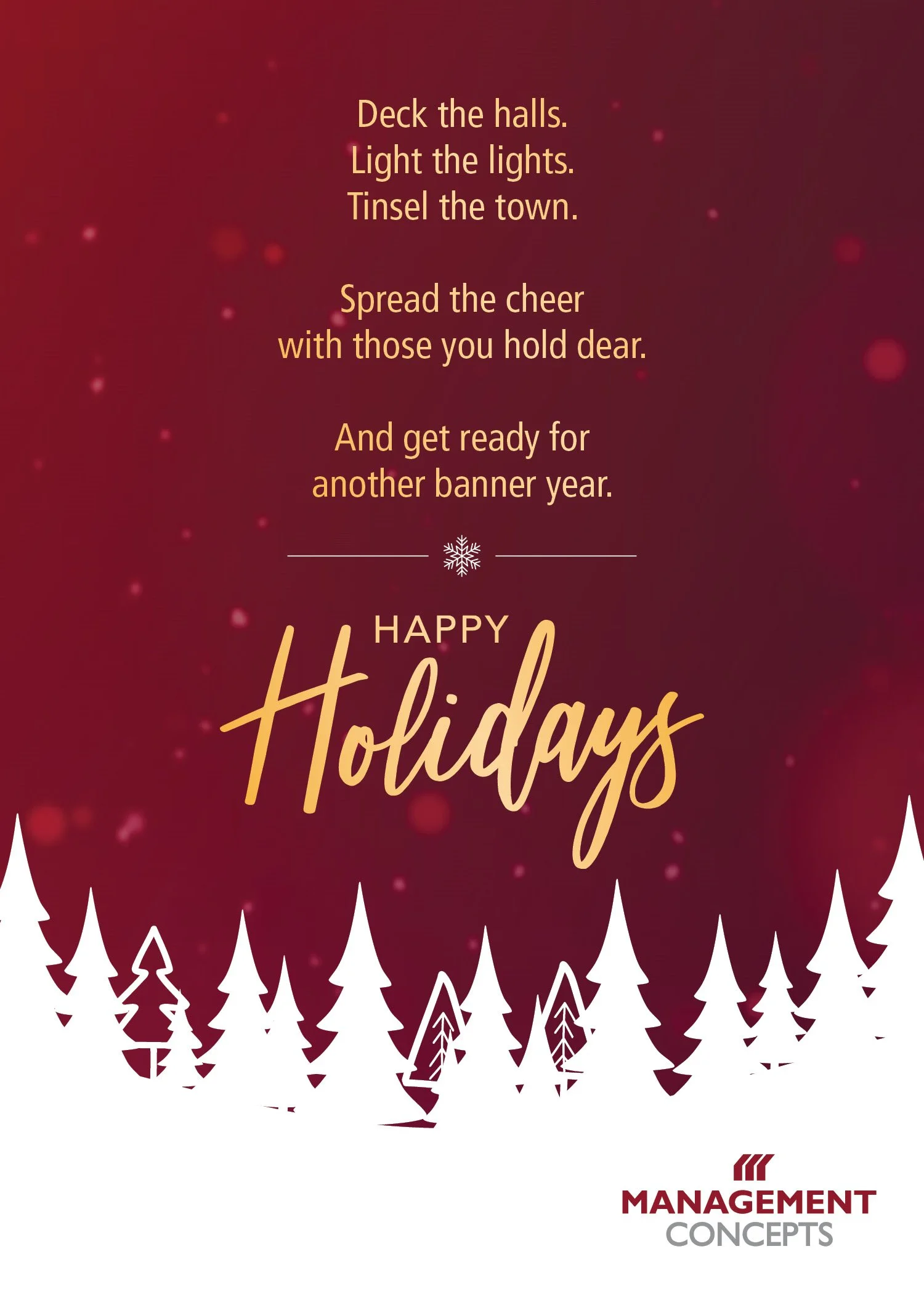
Holiday Greeting 2021
Every year my company sends out a holiday e-card image and this year I was able to offer both an e-card and video option to send out to our clients.
DITAP Explainer Video
This product explainer video was created to offer supplementary information on our company’s website to learn more about the DITAP program.
Ideally, a marketing explainer videos should never exceed more than a couple of minutes, but this topic is extremely dense and our Product team wanted this video to cover as much information as possible because it is for a very specific audience.
Given the desired visuals for this video, I opted to create a simple Q&A-styled video.
Open Enrollment Awareness Ads
This is an ad campaign that I worked on back in August that will never see the light of day due to content revisions. However, I wanted to share these ads because it is the first time our team has considered wanting to do more detailed animation for ads.
The first set of ads in the series followed our typically our design template where the animation was simple and the CTA just faded in and out.
Whereas the following two sets of ads had more unique and different animation for displaying the content.
For anyone who has ever created detailed animated gifs in Photoshop, you could understand why I’m a little little disappointed that these two sets of ads were never published, because of how time consuming the process is, but I’m rolling with it as a teaching moment because our team now develops our new style of ads in After Effects.
Mission to Mars Interlude
I am currently working on developing the branding and visuals for a new program that my company will be rolling out next year.
The program combines online and classroom learning and the video below is the transition indicator that will play before jumping into the storyline of “Mission to Mars.”
RPA Explainer Video
One of my company’s 2020 initiatives was to start making in-house explainer videos. I was tasked with the first video in the series that covers “Robotic Process Automation.“
The desired visuals for this explainer video were to combine corporate footage with simple kinetic typography.
Internal Control Infographic
This is an infographic I recently worked on with my company’s copywriter. From the beginning we knew this was going to be a very complex and wordy piece, but the objective was to make sure the content related back to our customers and that the subject was fully explained.
Although, the infographic may not be very engaging upon first glance, this infographic is the first one in our series to use our company’s new color palette, making it 508 compliant.
FINAL: Microlearning Infographic
Isn’t cool to see the progression of your work? There is such a big difference between this infographic and my initial design in my last post.
FIRST DRAFT: Microlearning Infographic
This is a project I worked on over the past week and I loved the end result. Before I had joined my company, the company had never produced educational infographics and I’ve been given the opportunity to create a variety of infographic templates to use moving forward.
Initially I struggled with this layout because the client wanted a design that was unachievable with the provided content; however, all of that is being ironed-out for the next round. I’m posting this draft because the plan is to start from scratch on the design as the client reworks and refines the content.
COVID-19 Response: Pros and Cons of Remote Communication Tools
in Digital
In response to the chaos of COVID-19 and the stay-at-home order, my company responded with a pros and cons list of remote communication tools available for federal employees. This is my second infographic that I have created for the company and this design plays off the established vision for infographics that I created a few weeks prior.
Infographic: Create a Vision with your Data
in Digital
My company has recently become interested in publishing infographics to its blog and other social channels, so I have been tasked with creating the design and brand guidelines for all infographics moving forward.
Site Visit: The Lodge at Wakulla Springs
in Print
Last week, I had the opportunity to visit one of my company’s properties while on vacation in the Tallahassee area and I finally got to see some of my designs in person.
One of my tradeshow banners was in the lobby and it looked stunning with the interior design and architecture of the building.
The purpose of the banner was to inform guests of the different offerings available to them during their stay at The Lodge and to differentiate the Florida State Parks operations, which are also run on-site.
This menu was a really fun take on adding some flare to the The Lodge at Wakulla Spring’s logo by adding an ornamental design behind their original design. I was a little disappointed with the presentation of the menus (originally, I had these outsourced, but they clearly printed more in-house), but overall they matched perfectly with the restaurant’s elegant theme and decor.
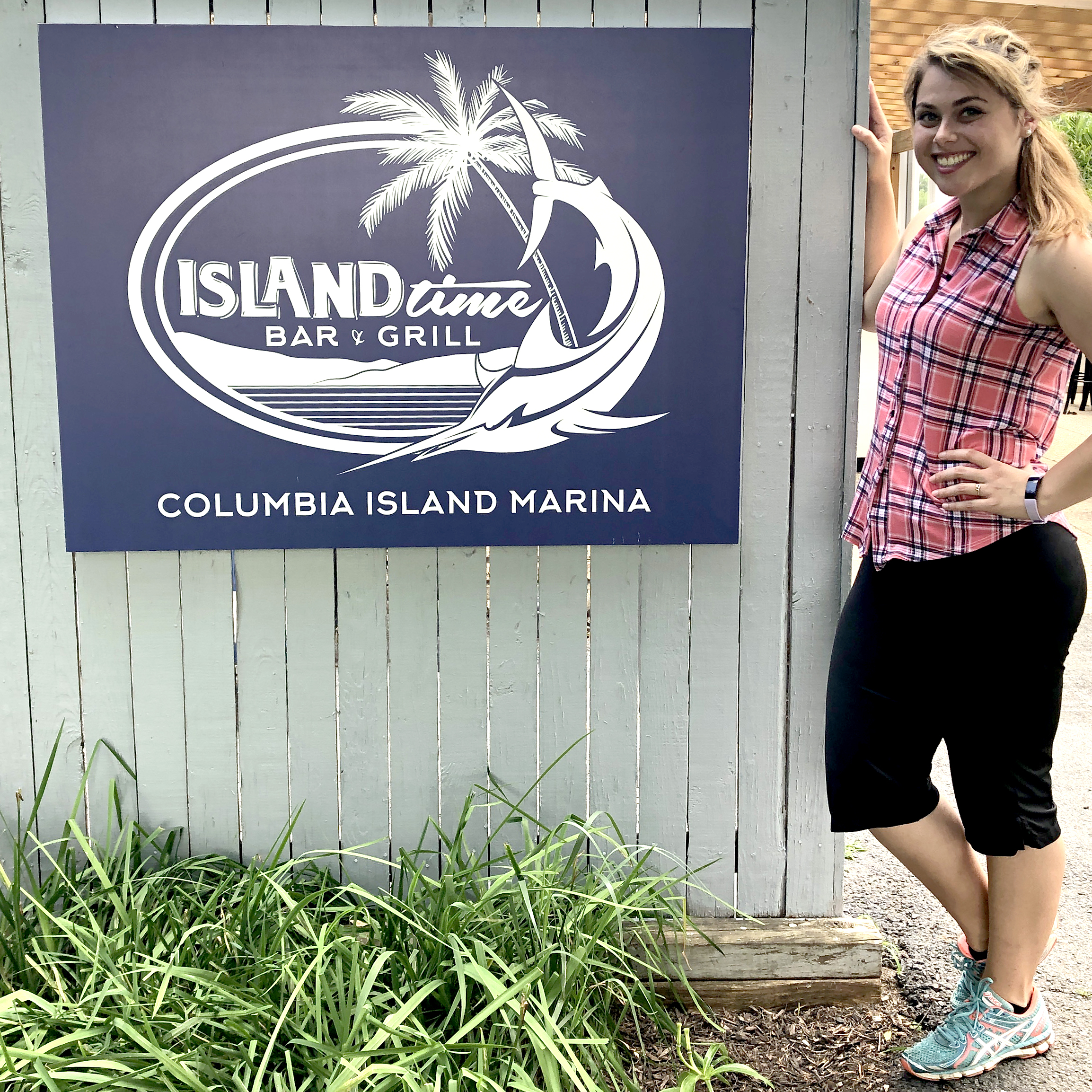
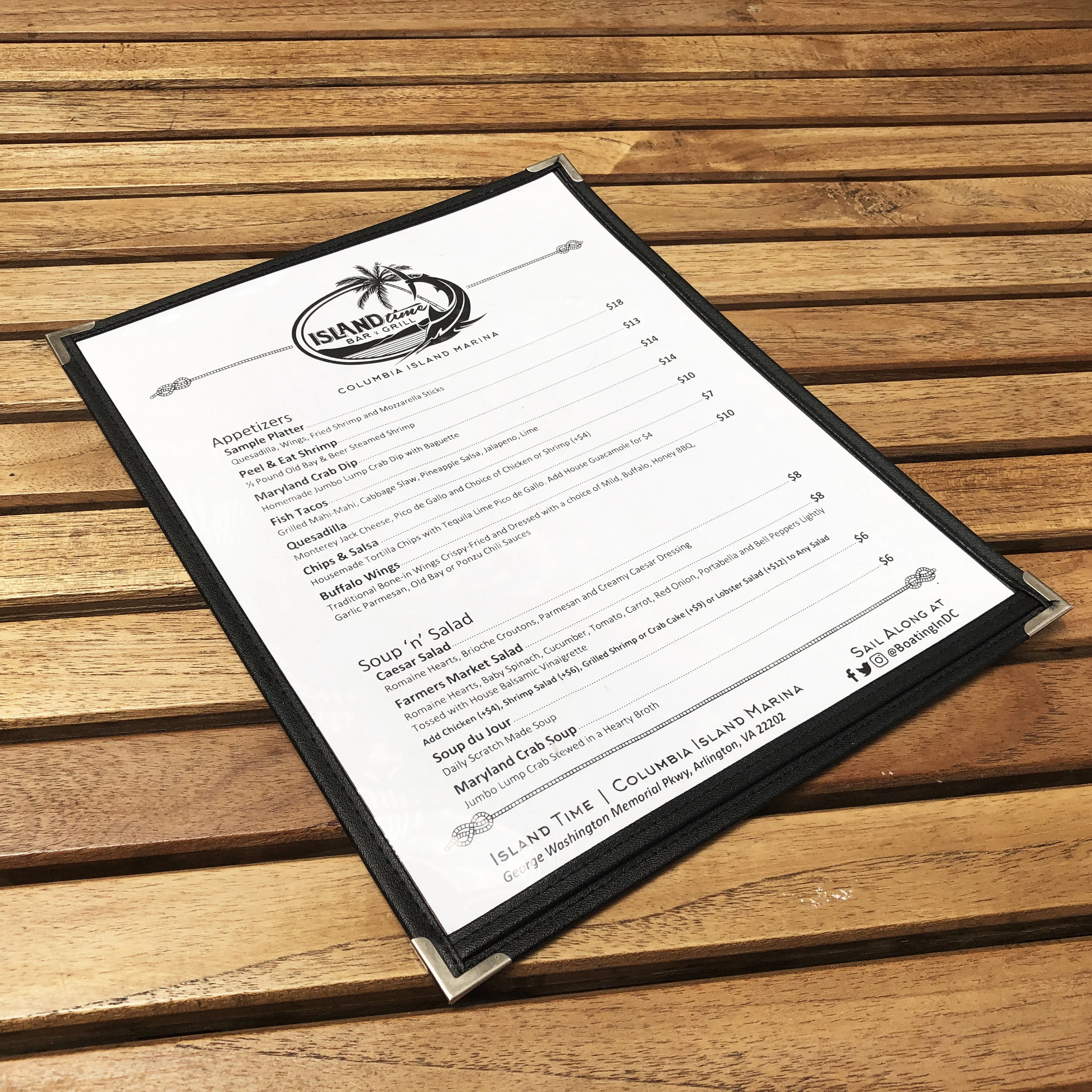
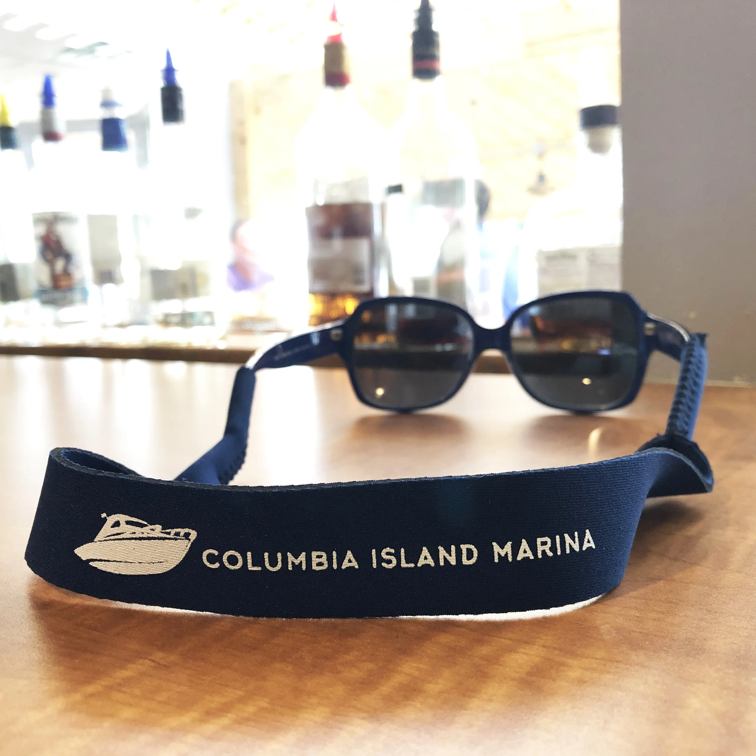
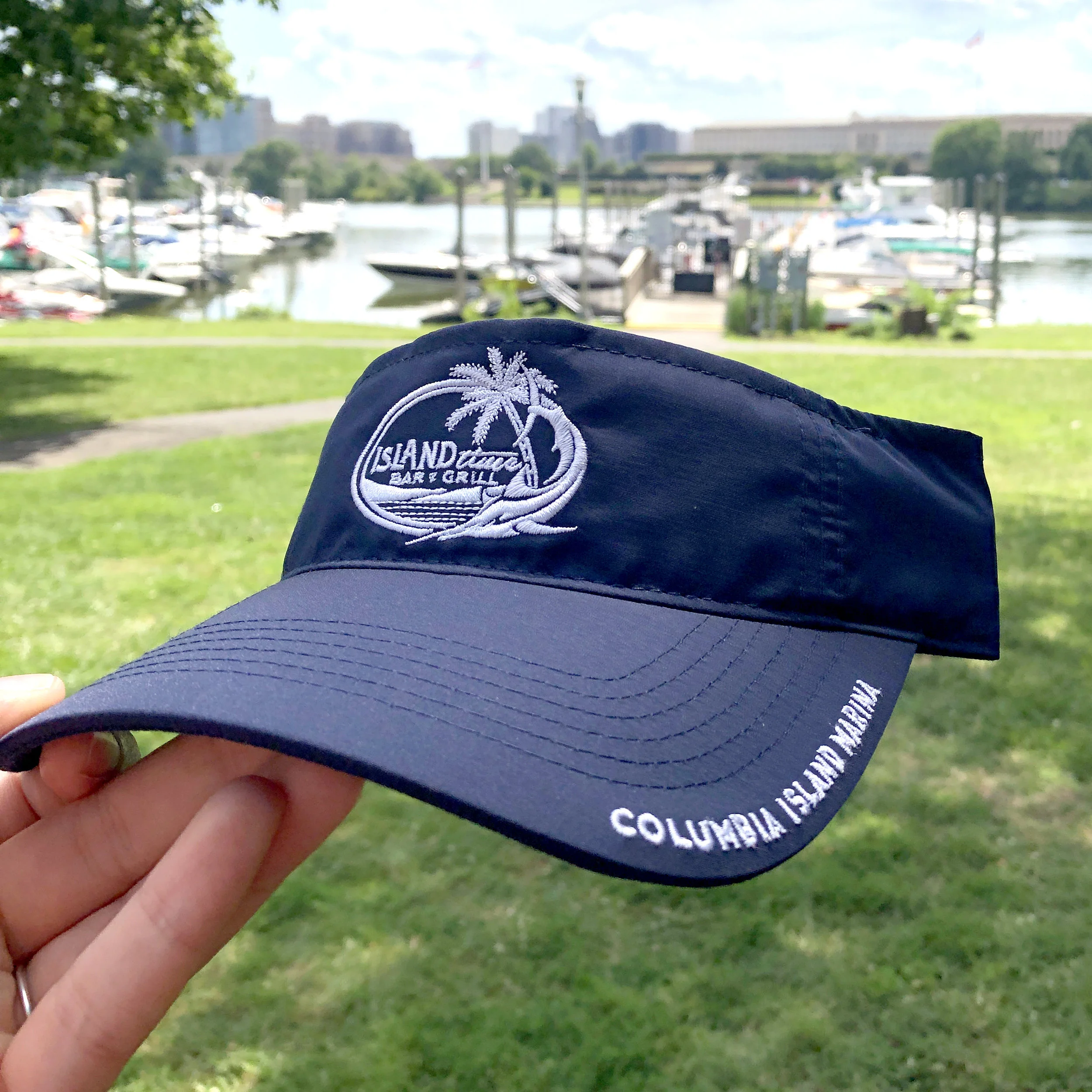
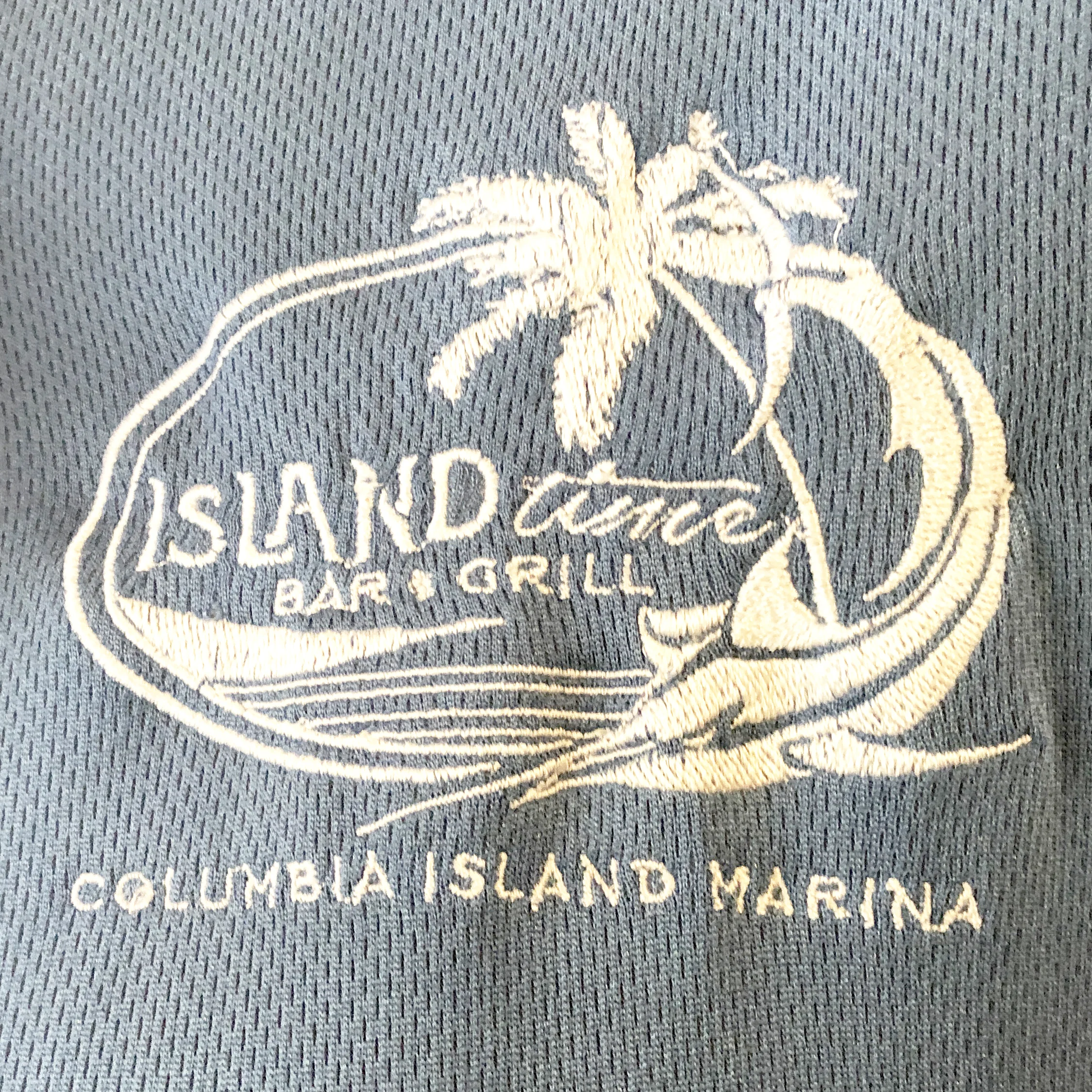
Site Visit: Island Time Bar & Grill at Columbia Island Marina
in Logo Design, Print
Last week, I finally got the chance to go see some of my work in person.
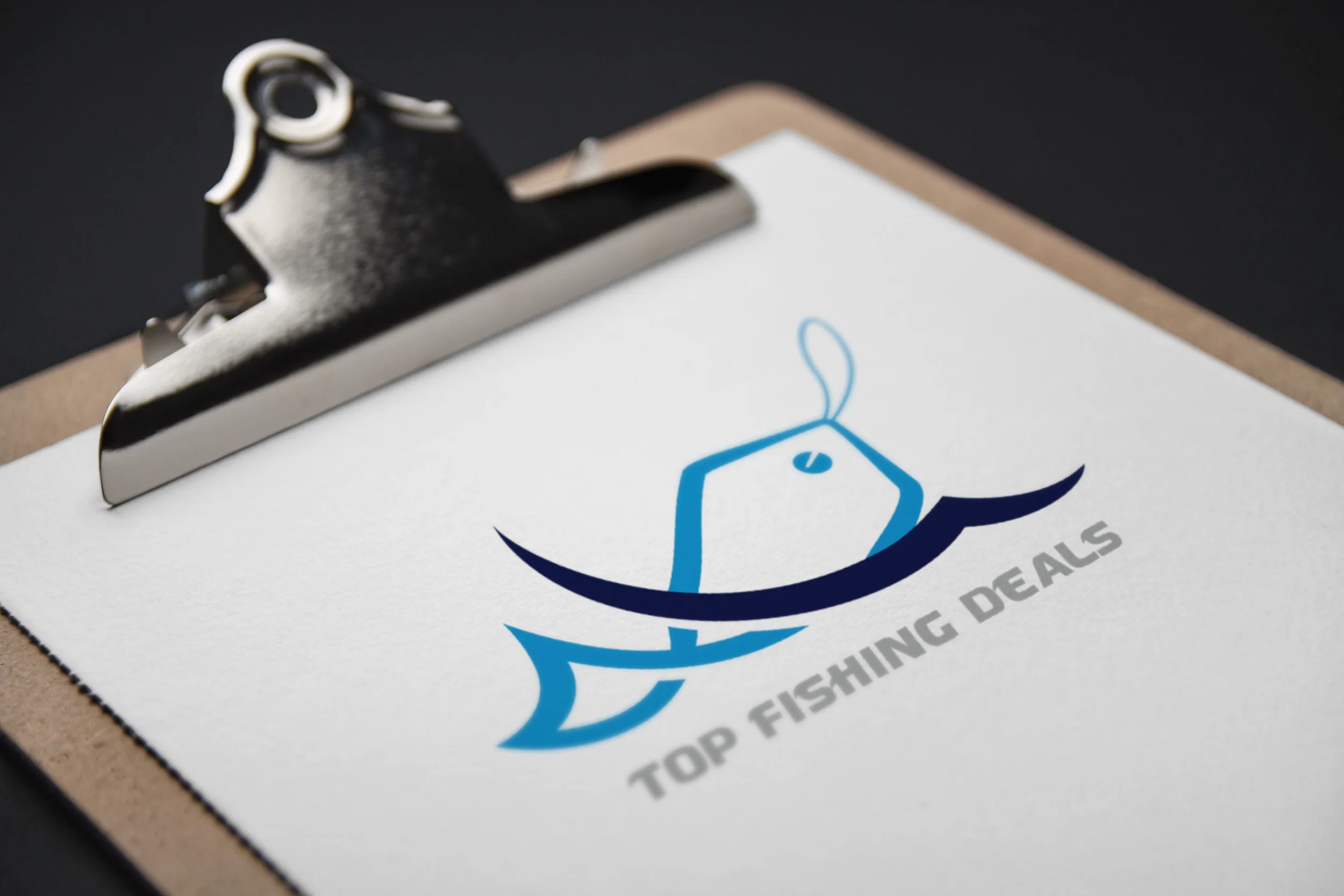
Freelance: Top Fishing Deals Logo
in Logo Design
Top Fishing Deals Logo
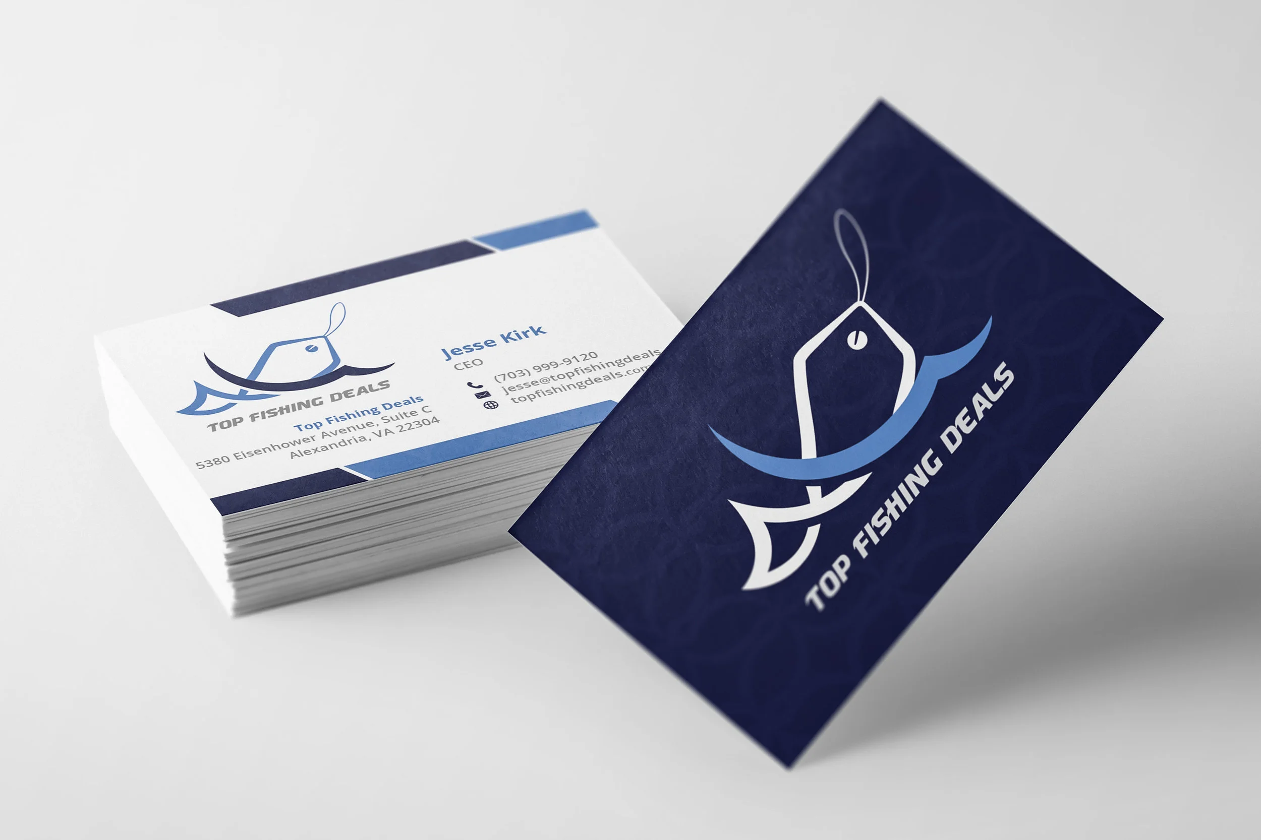
Recently, one of my clients reached out asking for feedback on logo that he had commissioned for a startup company. Unfortunately, the logo he paid for was taken straight off of a stock website, so I offered to create a new and original logo.
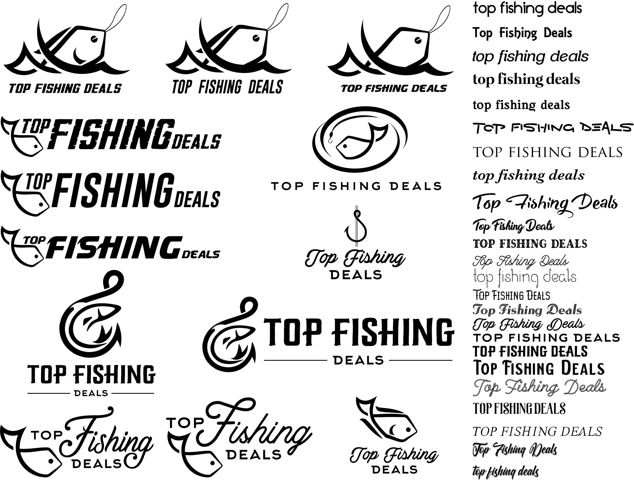
Below are a few variations of logos that I worked on as an alternative to the stock logo. I always like to have a document with all of my logo and font ideas on the same artboard so it is easier to see what works and what does not.
Marcom + San Diego
in Education
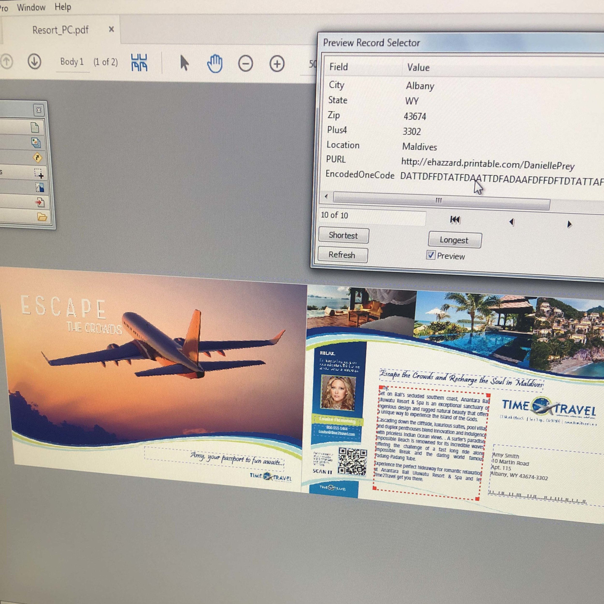
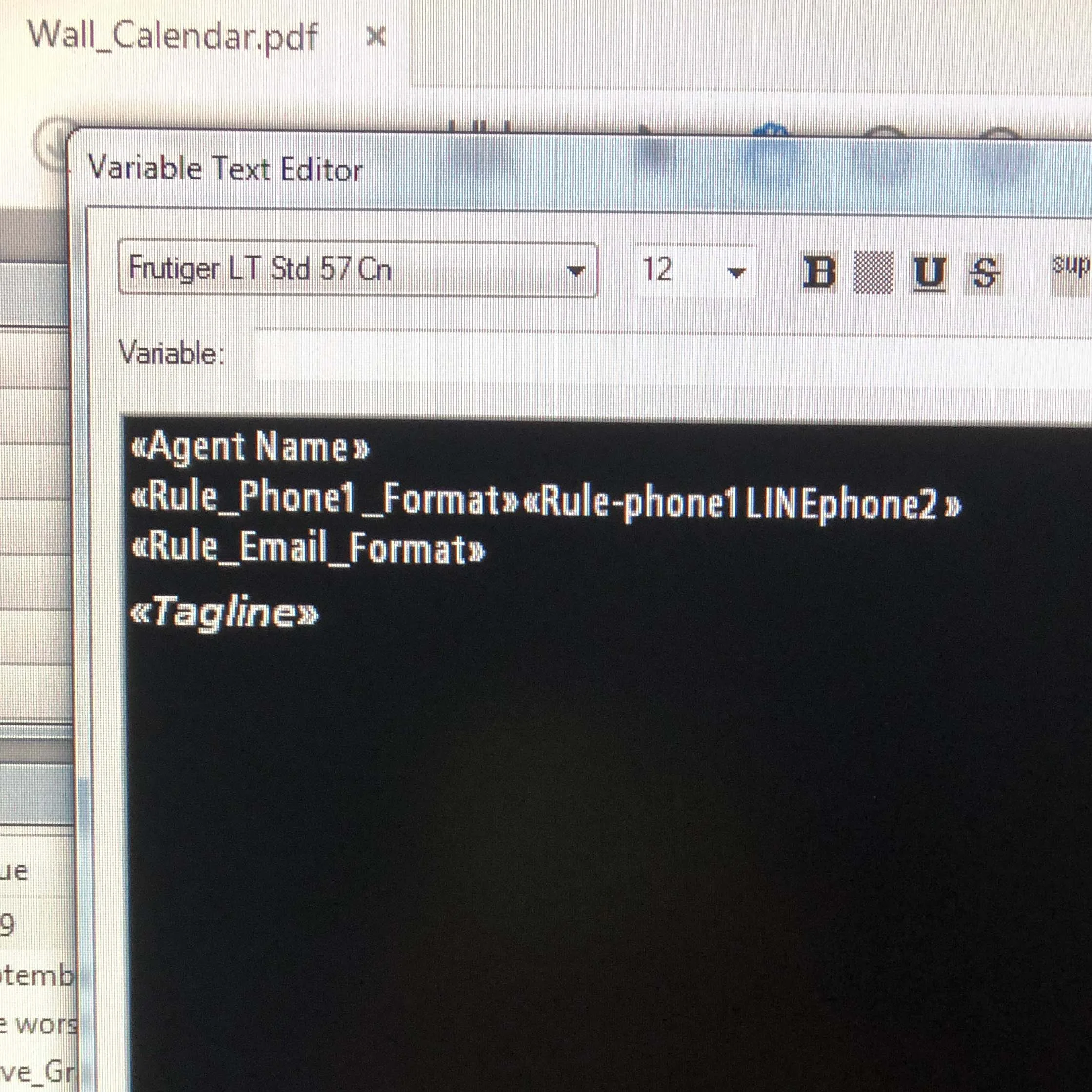
Earlier this month, my company flew me out to San Diego to learn how to use MarcomCentral’s InDesign plug-in, FusionPro. This will allow our company to have stricter brand guidelines and create templates in Adobe Acrobat that can be uploaded into Marcom’s system for our properties to order and edit marketing collateral more efficiently.
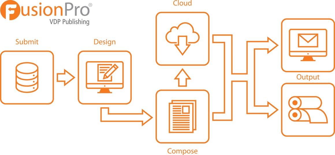
The diagram above explains how the Marcom system works with FusionPro. Admin designers, like myself, will upload content/templates into the system and users can then request and/or order a product or edit the template. That alert will then be turned into a ticket for our team to review before it gets sent to print or emailed as an instant download.
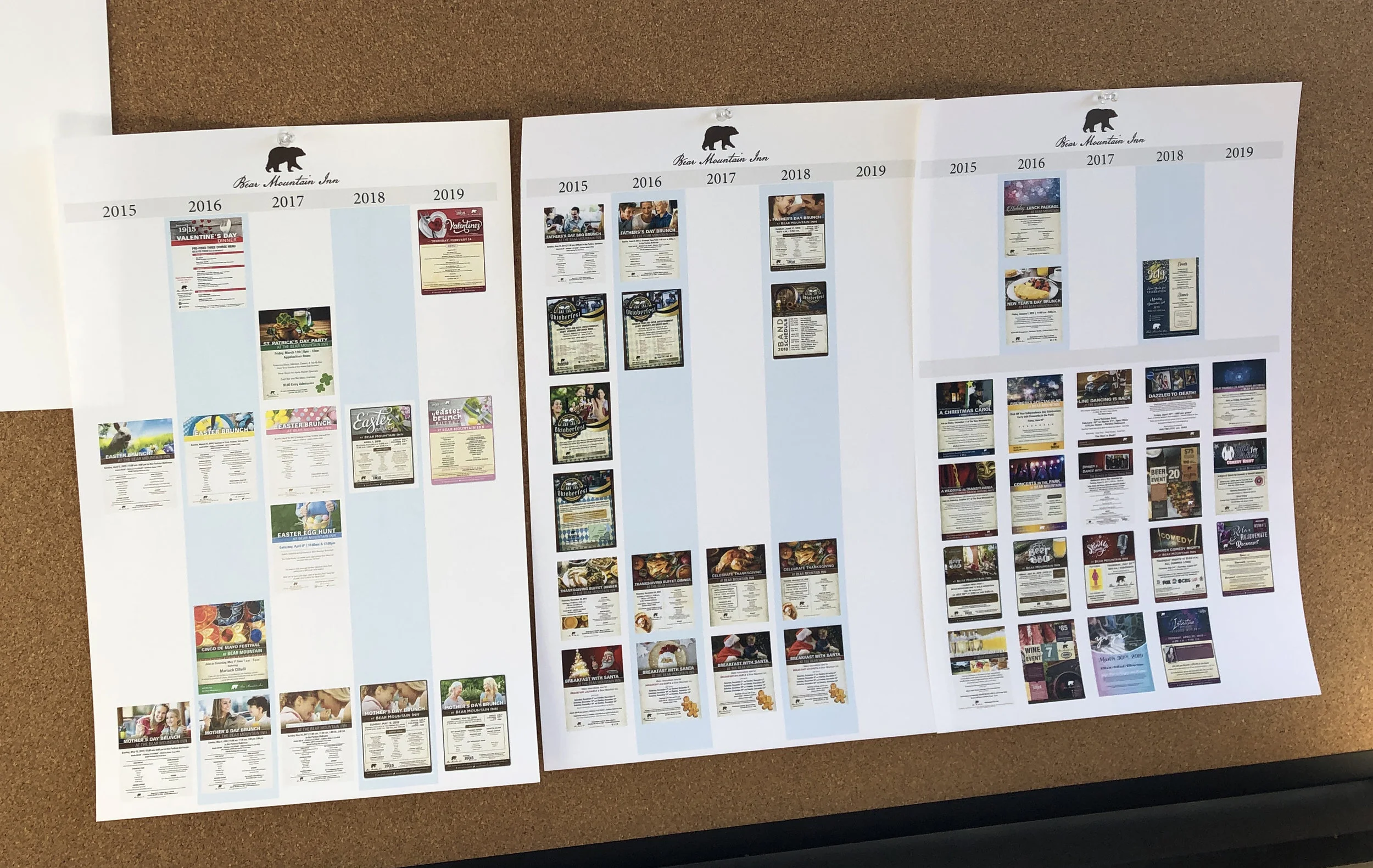
Over the next few months, I will be reviewing all of the marketing collateral our company has done over the past 5 years, updating it, and loading it into Marcom. Although I’ve only been with my company for a couple of years, it is really interesting to see how the company’s collateral has evolved over the years.
I am very excited to see how it all comes together.


